PNG vs JPG vs WebP: Which Is Best for Font Images?
Keep the letter detail that matters. A practical guide to image formats, export settings, and the checks to make before turning artwork into a font.
Reviewed against the current public MakeFont source-image workflow and documented A/B example. External references checked September 11, 2026. Format advice is based on their encoding properties and visual-review principles, not a MakeFont conversion benchmark.
Quick answer
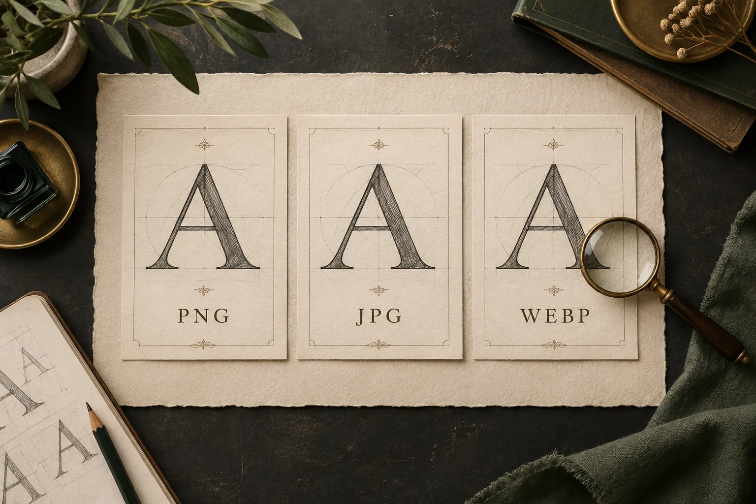
For freshly exported letter artwork, start with PNG when preserving the existing pixels is the priority. Keep a clear original JPG photograph if its letter edges already look good; converting it to PNG will not recover discarded detail. WebP is also an option, but check whether your exporter is using lossy or lossless encoding. In every case, inspect the actual strokes instead of trusting the file extension alone.
MakeFont accepts PNG, JPG, and WEBP source images up to 20 MB. Choose Image to Font for separated letter artwork or permitted photographed letterforms. Choose Handwriting to Font for a completed handwriting character sheet. The image format does not determine which of those two workflows fits your source.
Choose a format from the source you already have
A font source has a different job from a decorative website image: you need to inspect and separate the letter shapes. Thin strokes, enclosed spaces, and small gaps deserve attention. The smallest file is not automatically the most useful input, and a larger file does not automatically contain more recoverable detail.
| Source | Practical starting choice | Check before using it |
|---|---|---|
| Fresh letter artwork from a drawing app | PNG, or an explicitly lossless WebP export | Keep the strokes and gaps visible; inspect any resizing or background change. |
| A clear original phone photo | Keep the original JPG if it passes visual review | Look at focus, lighting, cropping, and compression around the letters. |
| An existing WebP image | Keep it if the decoded image is clear | The extension alone does not tell you whether lossy encoding was used. |
| A tiny image downloaded from a chat or website | Find a better original before converting formats | A different extension cannot reconstruct missing image detail. |
| A source above the upload limit | Export a separate, smaller working copy | Preserve the original and compare the new copy at the same viewing scale. |
For a filled handwriting sheet, use the handwriting-specific workflow regardless of whether the file is PNG or JPG. For a set of illustrated letters, start in the image workspace. If the letters overlap or the camera cut off their edges, follow the source-image preparation checklist before spending time on export settings.
PNG: a useful starting point for fresh letter artwork
The W3C PNG specification (opens in a new tab) defines a lossless raster-image format with an optional alpha channel for transparency. Lossless encoding preserves the image samples being encoded. It does not mean that every action before export—such as resizing, reducing colors, or flattening layers—preserved your original artwork.
When you draw letters in an editor and need a first working export, PNG is a reasonable way to avoid adding lossy compression at that stage. Inspect the exported file itself. Check that a thin stroke is still continuous, that the hole inside an e has not filled, and that neighboring characters still have enough space between them.
JPG: judge the photograph, then the compression
JPG and JPEG refer to the same familiar format family. In normal photo-export workflows, JPEG uses lossy compression. Adobe’s image-compression guide (opens in a new tab) explains that this reduces file size by discarding image detail. A smaller export can be convenient, but it deserves a close look around high-contrast lettering.
A well-focused phone photo can be a better font source than an out-of-focus PNG screenshot. Look first for complete letters, even lighting, and a camera angle that keeps the shapes understandable. Then zoom in to check for distracting blocks or pale halos around dark edges. Do not assume that every JPG will have visible damage, or that a particular quality number is equivalent across different editors.
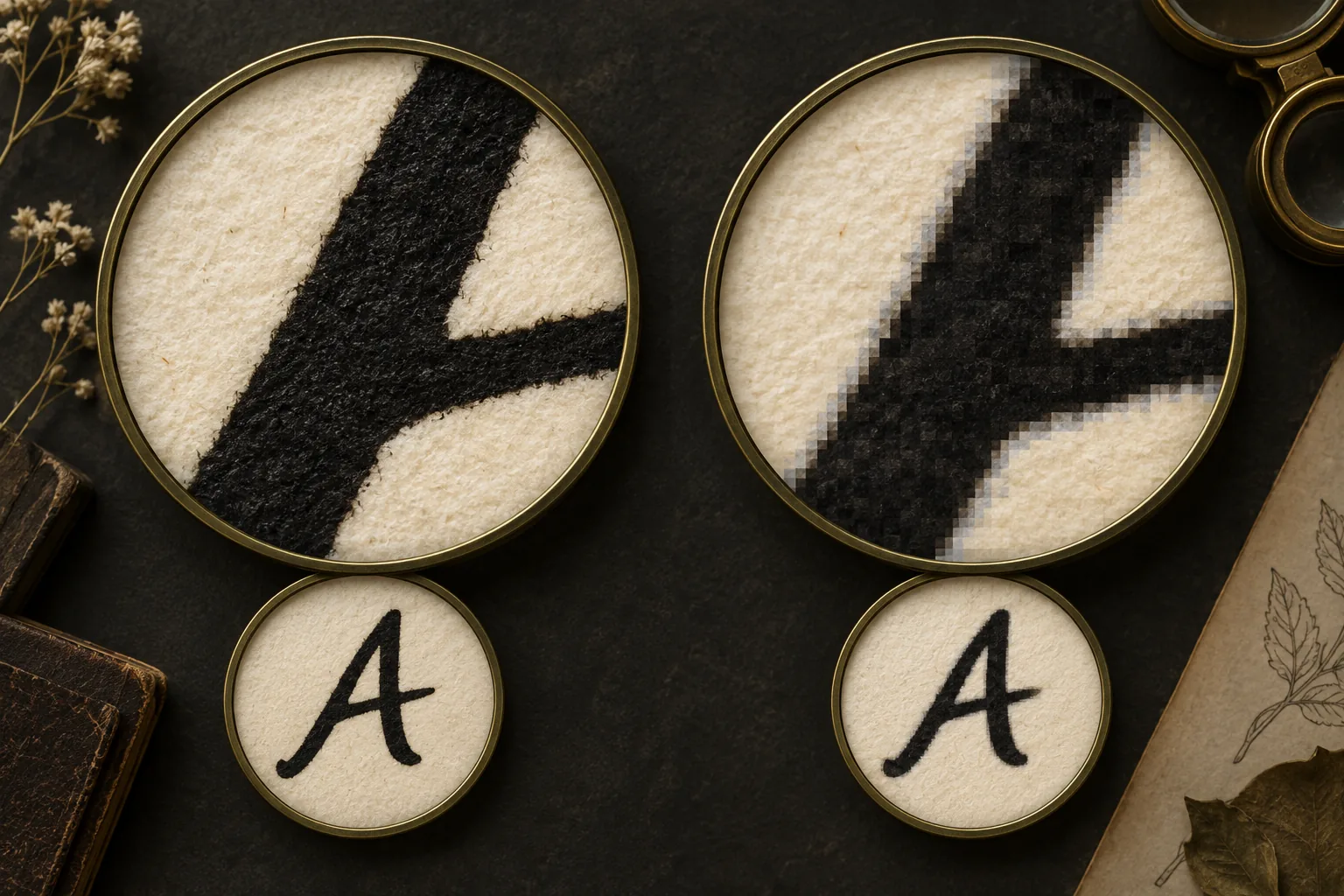
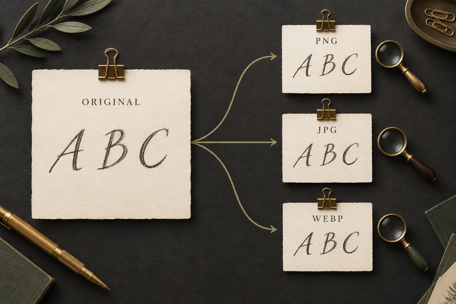
For a new export, compare a candidate with the original at the same scale. Open the same small letter and inspect the same gap in both files. Keep the copy that retains useful detail within the upload limit. If you make another edit, return to the best original or an editable master so that you can assess a fresh export rather than building an uncertain chain of conversions.
WebP: check the encoding mode, not just the suffix
Google’s WebP compression documentation (opens in a new tab) describes both lossy and lossless encoding, along with transparency support. That means a .webp filename alone does not establish whether the visible image data was preserved losslessly. The export setting and the history of the source matter.
If your editor offers an explicit lossless option, it is worth considering for letter artwork. If you have only an existing WebP file, open it and inspect the contours instead of assuming it is better or worse than another format. A WebP copied from a small website thumbnail may be limited by its dimensions or earlier processing, even if a later save uses lossless encoding.
Check pixels, file size, and the background separately
Pixel dimensions describe the grid of image samples; file size describes the stored bytes. The two are related, but they are not interchangeable measures of usable detail. A wide picture containing lots of blank desk may give each letter little space. A tighter, careful crop can be more useful without enlarging any of the original strokes.
Transparency is another separate decision. A transparent export may be convenient when it contains only the intended letter shapes, but it is not a prerequisite for using a clear photograph. Inspect the file against a plain background to find pale strokes, stray pixels, or edges you might otherwise overlook. If you add a background to a copy, choose one that makes the letterforms easy to distinguish and check the result again.
- Keep every intended letter complete, including dots, accents, and descenders.
- Preserve open spaces inside letters and visible separation between neighboring characters.
- Check the exported image after any resizing, sharpening, background removal, or contrast adjustment.
- Use a genuine supported image export. Renaming a PDF, SVG, or HEIC file to .png does not convert its contents.
- Keep a separate original so that an unsuccessful cleanup or export can be retried.
Export a working copy without losing your starting point
- 01
Preserve the best available source
Keep the original camera image, scan, or editable artwork. Give your working export a distinct name so that a later comparison does not depend on remembering which file came first.
- 02
Make only the changes the source needs
Straighten a tilted page, crop unnecessary surroundings, or improve an unreadable background on a copy. Avoid aggressive cleanup that erases thin strokes. Judge each change before adding another one.
- 03
Choose a supported export
For fresh lettering, try PNG or explicitly lossless WebP first. For a clear photo, its original JPG may already be adequate. If your copy exceeds 20 MB, reduce unnecessary canvas area or make a carefully resized export and inspect what changed.
- 04
Open the exported file independently
Confirm that it opens, has the intended orientation and background, and includes all required characters. Review a large overall view and a close view of the thinnest strokes. The editor’s canvas alone does not prove that the exported file matches it.
- 05
Review the proposed glyphs after import
Check character labels, regions, outlines, bounds, and baseline in the Font Profile. If a defect already exists in the image, return to the source. If the image is clear but the proposal is wrong, correct the mapping or outline instead of cycling through formats.
When changing format will not solve the problem
| What you notice | Likely place to inspect | Better next step |
|---|---|---|
| Letters are soft in every exported version | Capture focus or the original dimensions | Find a sharper original or photograph the sheet again. |
| A light halo appears around dark strokes | Compression, sharpening, or background cleanup | Compare with the original and undo the step that introduced it. |
| Two characters become one proposed region | Character separation and region review | Separate the source letters or correct the proposed region. |
| O is assigned to the digit 0 | Character mapping | Correct the label; the extension cannot decide what the mark means. |
| The font still lacks needed punctuation | Source coverage | Supply and review the missing characters within the supported workflow. |
| A file with .png in its name is rejected | Actual file type, validity, and size | Export a supported image from an editor and check the file again. |
After the source is readable, shift your attention to the font itself. The handwriting-font testing guide explains how to check character mapping, spacing, clipping, and the actual words you plan to use. Those checks remain necessary even when the image export is technically lossless.
What the image choice does—and does not—change in MakeFont
In the current public workflow, source inspection, OCR proposals, tracing, and editing run in the browser. The source image stays in local IndexedDB and is not uploaded or synced; optional cloud sync applies to the Font Profile and derived artifacts. Sign in to start the TTF/WOFF2 build and preview flow, and use the TTF download for the current downloadable font output.
Read the privacy policy for account-data boundaries and current pricing for plan decisions. Changing a JPG into a PNG does not change those account rules or guarantee a successful font result.
New font projects support English, Spanish, French, German, and Portuguese. Missing letters stay missing, and a small sample does not establish complete-language support. The documented two-character example has a deliberately narrow scope. Use letter artwork you have permission to adapt, and review acceptable use before distributing the result; an image conversion does not grant rights.
A short checklist before you start
- The file is a valid PNG, JPG, or WEBP within the 20 MB limit.
- Every supplied letter has readable strokes, complete bounds, and enough space around it.
- The export has been compared with the original, including thin strokes and small enclosed spaces.
- Any resized or cleaned version is a separate working copy.
- You know which characters are present, which are missing, and which need closer review.
- Your source is permitted for the intended use, and you will test the built font with real text.
Choose the clearest practical copy, then move on to the glyph review. If you can already see the letters and their boundaries clearly, repeatedly changing formats is unlikely to answer the next question: whether each supplied shape is correctly mapped and usable in your font.
Technical references used in this guide
- W3C: PNG Specification, Third Edition (opens in a new tab) — lossless image storage and optional transparency.
- Adobe: image compression in Photoshop (opens in a new tab) — the tradeoff between JPEG compression and retained detail.
- Google: WebP compression techniques (opens in a new tab) — lossy and lossless WebP modes and transparency support.
These sources explain the formats. They do not endorse MakeFont or measure its recognition, tracing, or font quality. The three illustrations are explanatory artwork, and the recommendations are starting points for reviewing your own source.
Questions before your first font conversion
From a clear image to reviewed glyphs
Start with the letter image you can inspect clearly
Choose a supported source, review the proposed characters and outlines, then build and test your font.
Choose your next step
Start with the source you already have
Prepare the source
Check capture, contrast, and letter separation before export.
Read the preparation guideTest the resulting font
Inspect mapping, coverage, spacing, and your real text.
Use the font test checklist