How to Test a Handwriting Font Before You Use It
A good-looking alphabet is only the beginning. Check the words, numbers, punctuation, and layout your font will actually need to handle.
Reviewed against MakeFont’s current image-processing and font-build implementation and the public A/B example. The test strings below are suggested checks, not results from a tested full alphabet. External technical references checked September 10, 2026.
Quick answer
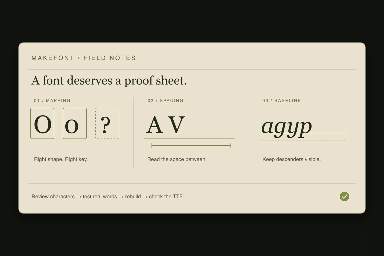
To test a handwriting font, first confirm that every character you need is present and mapped to the right key. Then read repeated letters, difficult pairs, numbers, punctuation, and your actual text at the intended size. Finally, rebuild after corrections and check the downloaded TTF in the application where you will use it. A successful build or an attractive alphabet preview does not establish that all of those checks pass.
If you are starting from a completed handwriting sheet, use Handwriting to Font. For separated letter artwork or permitted photographed letterforms, use Image to Font. The checks in this guide apply after you have reviewed the proposed characters and outlines.
Start with the right source and a small test brief
Decide what the font must do before judging it. A name on a birthday card needs a different character set from a journal template with dates, prices, and paragraphs. Write down the exact text, target application, smallest intended size, and whether the output will be printed or viewed on a screen. These choices turn a vague visual review into a repeatable check.
MakeFont’s handwriting workspace is the route for a completed character sheet. The image workspace is for separated artwork and other permitted letter images. Neither source choice makes a partial alphabet complete. If strokes are faint, cropped, or touching, revisit the source-image preparation guide before trying to solve the damage through font spacing.
Build a proof sheet that matches your character set
A proof sheet is a small collection of text that exposes different kinds of font problems. Copy the rows relevant to your project into your test document. These examples target basic Latin text; they are not a claim that your profile contains every listed character. For Spanish, French, German, or Portuguese work, add real words that exercise the required accented letters and punctuation.
| Check | Suggested text | What to inspect |
|---|---|---|
| Character mapping | O0 O0 / I1l I1l / B8 B8 | Each letter and digit produces its intended shape. |
| Repeated letters | nnnn oooo HHHH OOOO | The rhythm stays readable without unexplained gaps or collisions. |
| Mixed neighbors | nonono minimum / AV VA To Ta Wa | Round, straight, and diagonal shapes sit comfortably together. |
| Baseline and height | minimum HHO / gypqj | Ordinary letters share an intentional baseline; descenders remain visible. |
| Numbers and punctuation | 09/10/2026 12:45 / 19.95 / (Hello!) | Dates, decimals, brackets, and punctuation work at the intended size. |
| Real use | Your exact heading, name, caption, or paragraph | The font handles the text you actually plan to publish. |
An alphabet line is useful for coverage, but it does not reproduce normal reading. A pangram can add variety, yet one sentence still misses many punctuation marks, case combinations, names, and language-specific characters. Put your real copy at the end of the sheet and treat that row as a required check.
Check missing characters and incorrect mappings first
A character is the text value you type; a glyph is the shape the font draws for it. The OpenType character-to-glyph mapping specification (opens in a new tab) describes the table that connects those values to glyphs. This is why a beautiful outline assigned to the wrong character is still a broken result for the reader.
- 01
Compare your required text with profile coverage
List the uppercase, lowercase, numbers, and punctuation that your project uses. Include spaces and any accented letters you need. Check the profile’s mappings individually instead of treating the number of visible outlines as proof of coverage.
- 02
Type easily confused characters separately
Inspect O and 0, uppercase I, lowercase l, and 1. A handwritten mark can be ambiguous to recognition and to a human reader. Correct the assigned character when the shape belongs elsewhere; redraw it when the design itself is too ambiguous for the job.
- 03
Investigate any letter that looks unexpectedly different
Depending on the application, a missing character may appear as a box, disappear, or come from a fallback font. A readable word can therefore hide incomplete coverage. Compare suspicious characters with the profile and test the final file, not only the appearance of the sentence.
When a character is missing, add a suitable source character within the supported workflow or revise the intended text. Do not relabel an unrelated shape just to make a coverage indicator look complete. That changes what a key produces without solving the underlying design problem.
Separate outline problems from spacing problems
Spacing has its own measurements. OpenType’s horizontal metrics specification (opens in a new tab) defines advance widths and left side bearings. In practical terms, the distance to the next letter is not simply the visible width of the black shape. A clean outline can still produce cramped or loose text.
Start with repeated letters, then alternate straight and round forms. If every neighbor of one character looks too far away, inspect that glyph’s bounds and spacing. If the basic rhythm works but a few pairs look awkward, record those pairs separately. Do not stretch a letter’s artwork to repair every space around it; you may change its weight and proportions while leaving other combinations worse.
Keep some of the variation that makes your handwriting recognizable. The goal is a readable rhythm, not identical rectangles around every letter. Judge changes in a short word and a longer sentence at the same size, then return to the repeated-letter row to see whether the basic spacing remains consistent.
Inspect baseline, clipping, and the intended reading size
The baseline is the reference line most letters sit on. Compare ordinary lowercase letters before inspecting descenders such as g, p, and y. Look for one glyph floating above its neighbors, an unusually tall capital, or a descender cut off in a text box. Handwriting can have an intentional bounce; an accidental offset should still be corrected when it disrupts reading.
Use a large view to find broken contours, unwanted specks, and closed counters—the enclosed spaces inside letters such as o and e. Then return to the actual reading size. A detail that looks elegant when enlarged can become a dark lump when reduced. If your project is a printed card, inspect a print at the final size instead of relying only on a zoomed screen.
If clipping appears only in one application, compare its text-box height and line spacing with another document before changing the font. If the outline itself is incomplete in the profile, return to the source and tracing review. Diagnose where the failure appears; font geometry and document layout are different places to make a correction.
Rebuild and test the downloaded TTF
In MakeFont, image inspection, OCR proposals, tracing, and editing run in the browser. Recognition remains a proposal: review the regions, labels, outlines, bounds, baseline, spacing, and coverage. Sign-in starts the font build and preview flow. After a correction, make sure the build reflects the edited profile before you judge the result or download it.
The current workflow uses WOFF2 for the web preview and provides TTF as the downloadable font. The W3C WOFF2 specification (opens in a new tab) explains the compressed web-font format; it does not establish the quality of a particular font. Check the TTF in your destination application because a browser preview alone does not demonstrate that your final document behaves as intended.
- 01
Review the current build
Wait for the build to finish and read any validation or missing-coverage messages. Re-run your relevant test strings. Keep a note of unresolved issues rather than treating file generation as approval.
- 02
Open the exported font in your normal font manager
Download the TTF and follow your operating system’s font installation or preview flow. If it reports a validation problem, keep the diagnostic message and investigate before using the file. Installation alone is not a visual quality test.
- 03
Select the font in the actual destination app
Create a fresh document with the exact text, size, and layout from your brief. If an older font version still appears, check which file is installed and reopen the application as needed. Recheck the output after any further edit and rebuild.
Use the symptom to choose your next correction
| Symptom | First place to check | Next action |
|---|---|---|
| A key produces the wrong letter | Character mapping | Correct the label, then rebuild and type that key again. |
| A single letter uses a different style | Coverage and fallback | Check whether the character exists in the font before editing its neighbors. |
| One letter creates gaps in many words | Bounds and spacing | Inspect that glyph’s measurements, then retest several combinations. |
| Thin details disappear at small sizes | Outline and intended use | Simplify or redraw the affected shape; compare again at the final size. |
| A descender is cut off | Outline, baseline, and text box | Identify whether the crop exists in the font or only in the document. |
| The installed font ignores an edit | Build and installed file | Confirm that the downloaded TTF came from the revised profile. |
Keep coverage, privacy, and permission separate from quality
New MakeFont projects support English, Spanish, French, German, and Portuguese with a fixed character set for the selected language. A short source is not proof that every required glyph is usable. The public two-character A/B example demonstrates a narrow checked path, not the performance of a full handwriting family.
The source image stays in local IndexedDB and is not uploaded or synced; optional cloud sync concerns the Font Profile and derived artifacts. Keep your own original source, and read the privacy policy for account-data boundaries. Check current plans when deciding whether the available account limits fit your project.
Use handwriting or letter artwork you have permission to turn into a font. A clean trace, a successful test sheet, and a downloaded file do not establish commercial-use rights. Review MakeFont’s acceptable-use rules and resolve any source-permission questions before distributing the result.
Your final check before using the font
- Every character required by the actual document is present and mapped correctly.
- Repeated letters, difficult pairs, spaces, numbers, and punctuation remain readable.
- Baselines and letter sizes look intentional; counters and descenders stay visible.
- The font works at the intended size and in the destination application.
- The checked TTF comes from the latest corrected profile, and known limitations are recorded.
- You have kept the source and confirmed permission for the planned use.
Once these checks pass for your specific project, use the font in that project and keep the proof sheet with it. Revisit the sheet when you add characters, change spacing, or use the font in a different setting. Passing a small, documented test is more useful than assuming that one attractive sample covers every future use.
Technical references used in this guide
- Microsoft OpenType: cmap (opens in a new tab) — the distinction between character values and their mapped glyphs.
- Microsoft OpenType: hmtx (opens in a new tab) — advance widths and side bearings used to explain spacing.
- W3C: WOFF File Format 2.0 (opens in a new tab) — the purpose of the compressed web-font format used for preview.
These references explain font structures and formats. They do not endorse MakeFont or provide evidence that a specific generated font passes the suggested checks. Product behavior was reviewed separately, and the proof-sheet text is an editorial testing aid.
Questions before your first font conversion
Build your first proof sheet
Turn your handwriting into a font you can review
Start with a clear character sheet, review the proposed glyphs, then build and test the text you actually need.
Choose your next step
Start with the source you already have
Improve the source first
Fix contrast, capture, and character separation before tracing.
Read the image preparation guideInspect a documented example
See what the limited A/B fixture demonstrates and where its evidence ends.
View the A/B example