How to Prepare an Image for a Font Generator
A practical source-image checklist for cleaner character regions, more predictable tracing, and an easier first font review.
Reviewed against the current Image to Font and Handwriting to Font workflows, plus MakeFont’s checked-in A/B example. External technical references were last checked on September 7, 2026.
Quick answer
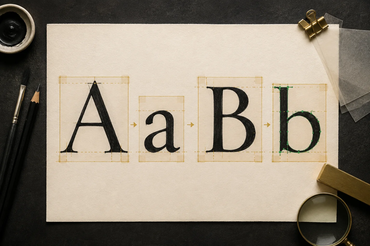
Prepare an image for a font generator by using dark, complete letterforms on a plain background, leaving visible space around every character, and photographing or scanning the page straight on. Decide which characters the image is supposed to contain before upload. A font generator can trace and organize supplied shapes, but it cannot reliably recover strokes cropped out of the picture or prove which character an ambiguous mark was meant to be.
Choose the route that matches the source. Use Image to Font for separated letter images, lettering artwork, or permitted photographed letterforms. Use Handwriting to Font for a filled handwriting character sheet. Both routes keep recognition editable and leave missing characters visible.
Choose the right workspace
Image to Font or Handwriting to Font?
The preparation rules overlap, but the starting material is different. Open MakeFont Image to Font when you have separated letter images, a scanned lettering alphabet, or a permitted photograph whose characters you want to map individually. Open MakeFont Handwriting to Font when you have filled a handwriting sheet and want that sheet to become an editable Font Profile.
| Your source | Start here | What you review |
|---|---|---|
| Separated letters, lettering artwork, or a permitted photographed sign | Image to Font | Proposed regions, character labels, outlines, bounds, baselines, and missing coverage |
| A filled sheet containing your own handwritten character set | Handwriting to Font | The same editable glyph decisions, with guidance written for a handwriting-sheet source |
| A partial alphabet or a small display-letter set | Image to Font | Only the supplied characters; unprovided positions remain visibly missing |
Start here
The five source checks that matter most
A beautiful page is not automatically a useful font source. The generator needs enough visual evidence to separate one intended character from the next and enough context for you to verify the proposed mapping. The Unicode Consortium’s confusable-character guidance (opens in a new tab) documents why shapes such as O and 0 can be visually confused; a written target list lets you resolve that ambiguity instead of asking image recognition to guess. These five checks catch most avoidable input problems before processing begins.
| Check | A useful source | Why it matters |
|---|---|---|
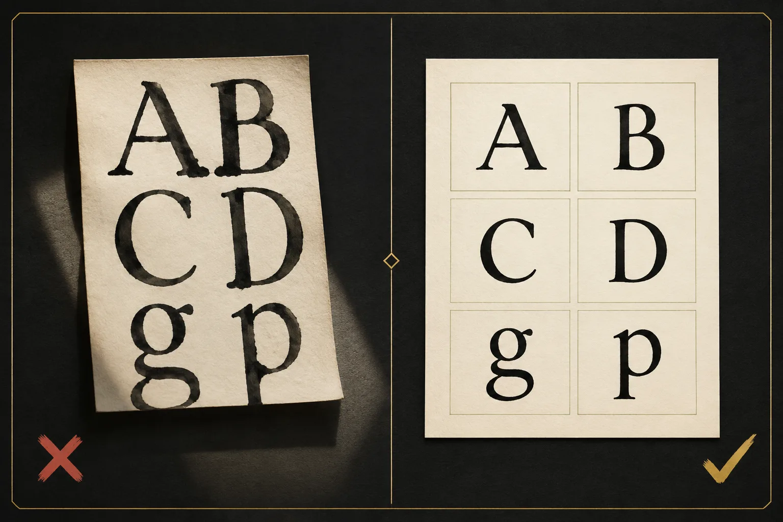
| Separation | One character per clear region with a margin on every side | Touching letters can become one region; tight crops can remove real strokes. |
| Completeness | Ascenders, accents, punctuation, and descenders are fully visible | A clipped y, j, accent, or comma produces an incomplete outline. |
| Contrast | Dark marks on an even, plain background | Shadows, ruled paper, texture, and faint strokes can compete with the intended ink. |
| Capture | A straight scan or square photograph with even focus | Perspective and blur change apparent proportions and make baseline review harder. |
| Target | A written list or template showing which character belongs in each space | The shape alone may not distinguish O from 0, I from l, or punctuation from noise. |
Why preparation changes the result
A source image is construction material, not just a visual hint
An image to font workflow is different from a font finder. A font finder tries to name an existing typeface that resembles a photograph. A font generator uses the shapes you supplied to create an editable character set. That makes missing edges, accidental marks, and uncertain labels part of the construction problem rather than harmless photographic noise.
The image first has to be divided into useful regions. Each region then needs a character label and a vector outline. Microsoft’s OpenType glyph-processing overview (opens in a new tab) explains that a font maps character code points to glyph IDs through its cmap data. After mapping, the outline still needs practical font information: bounds, a baseline, advance width, and enough coverage for the text you intend to type. A clean source does not make those decisions disappear, but it makes every decision easier to see and correct.
This is also why an imperfect but well-organized handwriting sheet can be more useful than a polished poster. The sheet tells you where one character begins, what it is supposed to mean, and whether important strokes extend above or below the writing line. The poster may look better while providing less reliable construction evidence.
Practical workflow
How to prepare letter images step by step
- 01
Choose the character target first
Write down the uppercase letters, lowercase letters, numbers, punctuation, or limited display set you actually need. A finite target makes missing characters visible and prevents a partial source from being mistaken for a complete font. If you are filling a character sheet, follow the Handwriting to Font workflow rather than treating the sheet as unrelated artwork.
- 02
Give every character its own space
Use a grid, guide sheet, or generous rows. Keep neighboring strokes apart. Leave extra room below g, j, p, q, and y, and above capitals, accents, and tall ascenders.
- 03
Keep the writing conditions consistent
Use the same pen, stroke weight, paper, scale, and general writing angle across the set. Intentional variation can be part of the design; accidental variation makes the first font harder to evaluate.
- 04
Capture the page straight on
Prefer a scan when available. For a photograph, keep the camera parallel to the page, use even light, avoid a hand or phone shadow, and make sure the smallest punctuation remains in focus. The US Federal Agencies Digital Guidelines Initiative publishes broader still-image digitization guidance (opens in a new tab) covering capture quality and consistent imaging practice.
- 05
Crop around the set, not through it
Remove unrelated desk or page area, but keep breathing room around the outermost characters. Check that no swash, accent, serif, or descender touches the crop edge.
- 06
Inspect the full-size image
Zoom to 100% before upload. Look for motion blur, broken faint strokes, paper texture, compression blocks, and small marks that could be mistaken for punctuation. Recapture when the defect affects many characters.
- 07
Keep the untouched original
Save a master scan or photograph before aggressive thresholding, sharpening, or background removal. If an edit erases a thin stroke, the original gives you a trustworthy way back.
Inside MakeFont
What happens after you upload the prepared image
MakeFont accepts PNG, JPG, and WEBP source images up to 20 MB. Inspection, OCR proposals, tracing, and editing run in the browser. The source image is kept in IndexedDB for the local project and is not uploaded or synced. Recognition remains a proposal: you review the character label, region, outline, bounds, baseline, and coverage instead of accepting a hidden automatic decision. The later build produces TTF and a web preview using WOFF2; the W3C WOFF2 Recommendation (opens in a new tab) defines WOFF2 as a compressed font format for Web use, not as a replacement for reviewing the underlying font data.
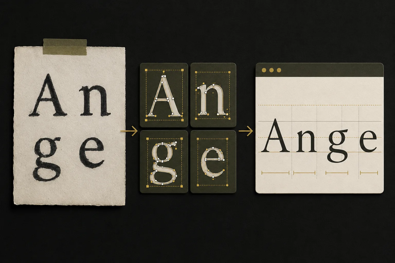

- Choose the source locally and inspect the proposed regions.
- Correct uncertain character labels before treating the mapping as final.
- Edit bounds, baseline, outline, or strokes where the visual result needs correction.
- Review found, uncertain, failed, and missing coverage as separate states.
- When the Image to Font profile is ready, sign in to start the TTF/WOFF2 build and preview, then download the TTF. Return to the Image to Font workspace for targeted corrections, and see the current plan information before deciding whether the signed-in workflow fits the project.
Diagnosis
Common source-image failures and the better next move
| What you see | Likely source problem | Better next move |
|---|---|---|
| Two letters appear as one region | The strokes touch or the gap is too narrow | Separate them in the source or provide a cleaner second image. |
| A descender or accent disappears | The character or page was cropped too tightly | Return to the uncropped original and leave a larger margin. |
| The outline includes paper lines or shadows | Background detail competes with the ink | Use even light, plain paper, or a cleaner scan instead of tracing every artifact. |
| Several characters lean or stretch the same way | The camera was not parallel to the page | Recapture straight on before correcting each outline separately. |
| O, 0, I, l, or punctuation is mislabeled — compare the Unicode confusables reference (opens in a new tab) | The image does not contain enough semantic context | Use the target sheet and correct the proposed mapping explicitly. |
| Thin strokes break into pieces | The source is faint, blurred, or over-compressed | Recapture at better contrast and focus; preserve the master before image edits. |
| The font feels uneven in words | Individual shapes were reviewed, but baseline or spacing was not | Test repeated words and mixed letter pairs, then adjust the glyph metrics rather than redrawing everything. |
These problems are useful signals. When the same defect appears across the whole sheet, improve the source. When one or two glyphs are wrong, keep the better source and make targeted edits. That distinction prevents a local correction from turning into unnecessary full-page rework.
Set expectations
What better preparation cannot solve by itself
- Missing characters: a clearer image cannot supply a letter, number, or symbol that was never included.
- Conflicting styles: if half the source is heavy marker and half is light pencil, better lighting will not turn them into one coherent design.
- Font identification: MakeFont creates an editable profile from supplied letterforms; it does not identify the name of an existing photographed typeface.
- Permission and originality: image quality does not establish copyright, trademark, licensing, or sharing rights.
- Unsupported writing systems: new font projects currently support English, Spanish, French, German, and Portuguese. Other languages and complex shaping systems remain outside the current release.
- Professional type design: clean tracing is a starting point. Kerning, spacing, language coverage, optical correction, and production testing still require judgment.
Only process material you are allowed to use, and review the acceptable-use boundaries before sharing or distributing a result. For details about local source handling and optional account features, read the privacy policy.
After tracing
How to evaluate the first font build
Do not judge a font only from an alphabet grid. Letters that look balanced alone can collide, float, or create uneven rhythm in real text. The OpenType horizontal metrics specification (opens in a new tab) distinguishes glyph outlines from advance widths and side bearings, which is why a recognizable outline can still space badly. Start with the exact characters your source covers, then test repeated pairs, short words, mixed uppercase and lowercase, numbers, and punctuation. Compare the preview with the source rather than assuming a technically valid file is visually finished.
- 01
Check the baseline
Type words containing round, flat, tall, and descending letters. Look for characters that visibly float or sink.
- 02
Check side spacing
Repeat combinations such as HH, OO, nn, oo, AV, To, and punctuation pairs that exist in your target. Uneven rhythm often comes from metrics, not the outline.
- 03
Check small sizes
Thin gaps and interior counters that look open in a large glyph view may close in normal reading sizes.
- 04
Check coverage honestly
Treat missing and uncertain positions as unfinished or intentionally partial. Do not describe a limited display set as a complete alphabet.
- 05
Keep the revision path
Return to the editable Font Profile for targeted corrections, rebuild, and compare again instead of losing the link between source, glyph, and output.
You can inspect the current narrow build and its explicit evidence boundary on the MakeFont examples page.
Before upload
The 30-second image preparation checklist
- I know which characters this source is meant to contain.
- Every character has visible space on all four sides.
- Accents, punctuation, ascenders, and descenders are not clipped.
- The marks are in focus and clearly separated from the background.
- The page was scanned or photographed straight on with even light.
- No unrelated texture, ruled line, or shadow is likely to become part of a glyph.
- I kept the untouched original before applying image cleanup.
- I am prepared to review mappings, outlines, baselines, spacing, and missing coverage.
- I have permission to process and use the source material.
Evidence and standards
Technical references used in this guide
These sources explain the imaging and font-format concepts behind the practical advice. They do not endorse MakeFont and are not presented as product performance evidence.
- FADGI Technical Guidelines for Digitizing Cultural Heritage Materials (opens in a new tab) — federal still-image capture and quality guidance used here for the straight, evenly lit source recommendation.
- Microsoft OpenType glyph processing (opens in a new tab) — explains character-code-to-glyph mapping through cmap data.
- Microsoft OpenType horizontal metrics (opens in a new tab) — defines advance widths and side bearings used in horizontal text layout.
- Unicode Technical Standard #39 (opens in a new tab) — documents visually confusable characters and supports the recommendation to verify ambiguous mappings manually.
- W3C WOFF File Format 2.0 (opens in a new tab) — the current W3C Recommendation for the compressed Web font format used in browser previews.
Questions before your first font conversion
Ready to make your font?
Turn your prepared image into an editable font
Upload your letter image, review the proposed character regions and labels, then refine the outlines before building your TTF. Starting from a completed handwriting sheet? Use the handwriting-specific workflow instead.
Choose your next step
Start with the source you already have
Have separated letter images?
Upload lettering artwork or permitted photographed letterforms, then review proposed regions, labels, and outlines.
Start Image to FontHave a handwriting sheet?
Use the handwriting-specific workspace to map a completed character sheet into an editable Font Profile.
Start Handwriting to FontWant to see the workflow first?
Review the checked-in A/B example and see exactly what the current build verifies.
View the example